Whimsicalwood-Lettering
My first full-time job was working as a survey draftsman. In addition to learning the skilled use of drawing instruments with ink on linen and drafting film, hand lettering was used extensively on plans and maps.
For this lettering a pointed nib dip pen was used, mostly a Gillotts 303 nib. The lettering style to be used on plans featured a sans serif, mono-line, upright, printed letter form, in contrast to the swelling line of copperplate style writing.
I became very comfortable with the use of this type of nib and continue to use it for drawing. As part of our kit we were also supplied with a range of Mitchell square cut nibs which we never used.
Chancing upon a book by Edward Johnson in a library I soon found a use for the square cut nibs and began practising 'Foundation Hand' while developing an interest in calligraphy. I have found this early interest in calligraphy, though not pursued with the earestness required to become proficient, to be a great help in designing hand drawn lettering.
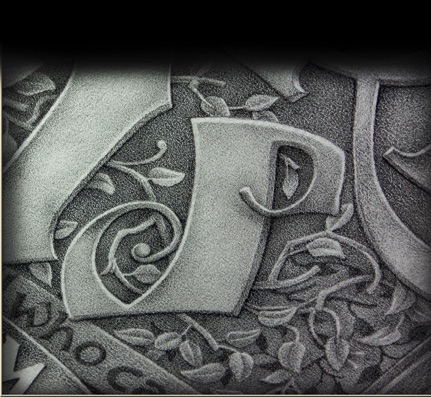
Hand-lettering with graphite and various black pencils is in some contrast to much pen and ink work as it presents as areas of contrasting and harmoniously related tone. Whereas ink pens do the same with line. There are methods of pen drawing that also rely on the building up of tone such as hatching and stippling but though the effect is unique and beautiful it is much more time consuming than black pencil work.
During my years working as a biological illustrator I used the stippling technique almost exclusively. I would like to do some stipple ink drawings again but time is the problem. Hand-drawn lettering with an emphasis on the use of tone could combine well in a poster-like work with purely pictorial intent. An art work that uses calligraphic forms as elements in a drawn work.
Hand-Lettering and Calligraphy